You are currently browsing the category archive for the ‘Information Graphics’ category.

Finally being ablt to draw conclusions upon the experiments.
Since developing the latent fingerprints from across all three experiments, I have used my system of recording and visualising them to be able to analyse each result individually. It was found that results visualised on certain paper types were more prominent than others, because of their effectiveness in reacting to the Ninydrin solution used.

The prototype of the second printed piece which visualises the results from experiment 3.
A prototype for the second printed piece was completed today, and the final files have been sent to print after making some final alterations. Using a system designed to visualise each fingerprint based on its surface area and pressure, I was able to map the levels of interaction across each of the separate components that make up the Printed Experiments.
Two colours were used as a way of differentiating between the two slightly different Printed Experiments that were distributed in different environments as a means of receiving contact from people. The results displayed in grey represent the fingerprints found on Printed Experiment 1, which was sent to family and friends from home, and the results displayed in blue represent the fingerprints retrieved from Printed Experiment 2 which was left in a Hairdressing Salon.
Results will be analysed from this printed piece in an attempt to answer the original Hypothesis, as well as providing a point of reference to the human interaction of my two printed experiments. Personally, I’m slightly unhappy about the aesthetic that it holds, and feels a little alienated from the original printed experiment. Three weeks have passed since I designed the initial Printed Experiments, and because of this, I feel that the consistency as to the look and feel of this second book has fallen slightly. However, it’s outcome was controlled by a system of rules, designed to best communicate the areas of human interaction, and so on this level, I think the way that it looks is as relevant as every other part of this project.

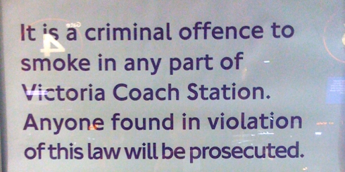
Bad practice, even worse when used in London signage:/
Whilst waiting for the bus home, I noticed this really bad typography that was used as part of the London transport signage system. Notice how tight the kerning on the last line is. Don’t think this can be put down to a genuine mistake, rather I think it was purposefully done out of pure laziness! Especially on such signage that represents our capital city’s transport, I didn’t think this was good practise at all.

Explaining my system in more detail.
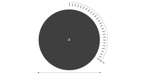
I have decided to represent each individual touchpoin with a circle. I want to communicate the idea of touch and interaction whilst visialy mapping the results, so have therfor chosen to use the circle as the focal point of the design.
The diameter of each circle obviousely represents the surface area of the fingerprint and the markets around it’s perimeter indicate the pressure of the paeticula print or group of prints. I hose to use an opacity of 75% for both sets of results as I found this best communicated the fact that fingerprints were often layered over time.
To keep the design consistent with other parts of my project, I have used the ‘>’ mark, predomenently featured in my logo as a mark that also indicates the pressure exerted by a fingerprint upon the printed page.

Nice piece of info graphics, effective treatment of type and image.
Well considered piece of information graphics in Amsterdam’s central square. Different from the usual signage systems throughout the city, this piece of info graphics stood out for me because of the arrangement of type on top of a large format photograph. Not only has the graphic been paid attention to, but also, the format of the sign itself. Unlike the common, flat metal sheet signs dotted around the city, this object had a shape that was unique, similar to that of a horse shoe, curved at one end and open at the other. This shape in particular enables you to be able to move around it, not just something that can be viewed from distance, but something that can be interacted with on a more physical level.

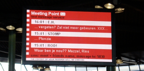
A nice little service in Amsterdam's Shiphol Airport.
A service located in the main terminal of Amsterdam’s Shiphol Airport. Works really well for the fact that it is instantly recognisable as a ‘meeting point.’ An SMS texting system, whereby messages are filtered and displayed upon the large LED screen is an effective way of relocating people if anyone gets lost. Or if known well, this part of the Airport acts as an effective way of forward communicating to family, friends and business partners if still on the flight, where the use of some phones are permitted.

A guest lecture by type designer Hamish Muir on the 10 March 2009.
Hamish Muir, formal pupil of the Bournemouth & Poole Institute of design and the Basel school of design, Switzerland held a presentation in the main lecture theatre on the 10 March 2009, commencing at approximately 1045 hours on the Tuesday morning.
He covered many ideas in design, particularly in typography that I found personally, very interesting. His earliest pieces of design were completed using purely hand crafted techniques. Muir worked from a small, shared office during the early 1980’s, without the digital technologies that we take for granted today. He expressed how in 1989, himself and a colleague bought their first Macintosh computer which set them back a massive £9,000. This price included a basic software package, with programmes such as Quark 2 and a hard-rive that was just 20 mb in size!
One particular concept that Muir expressed was his belief of ‘how little you can possibly do as a designer in order to be most effective.’ This idea was evident most predominantly in his typographical work, especially throughout the International Journal of Typography of which he was a co founder in, Octavo (meaning 8 pages, otherwise known as a signature.)
He also talked about how not everything within Graphic Design has to come from a ‘big’ idea, and that sometimes, a response to something quite insignificant, has the potential to be as equally powerful.

A study on logos and their symbolic representation of nature.
I cam across this whilst browsing the media bookmarking library, Dropular. (Haven’t been able to find the exact link I’m afraid, as the site gets updated ridiculously quickly these days!)
I found this piece, connected with that of the brand, quite fascinating. To me, it represents the sheer number of nature symbols that are being used in successful, modern branding today, in particular, animals. It has potential to make quite a nice little research project into the psychology effect that animals and nature have upon our human perception and willingness to buy. I remember coming across the term, ‘power animals’ some years back now. If I remember rightly, this was connected with the idea of using animal symbols in advertising. But overall, quite an interesting observation here!

Looking into how the decisions we make, reflect the type of person we are.
From my initial researh into decision making, I developed the understanding that the decisions inwhich we make can often paint quite an accurate picture of the types of people we are, in particular our personalities.
My visual experiment therefore involved me recording the decisions that my housemates made when faced with a range of yes, no and maybe questions that arrose in everyday conversation. I decided to plot the decisions on whether they were positive, negative or indecisive. From this, a visual picture begins to form, reflecting the nature of someone based on the everyday decisions that they make.
From recording his first Ice cream of the summer, to the number of visits to the Gym. New York based Graphic Designer, Nicholas Feltron has produced some really nice Info Graphics over recent years.
Above is an image of Feltron’s 2008 Atlas, from his 2008 Annual Report. Since 2005, Feltron has produced Annual Reports in document and Poster format. They are visual recordings of an orray of events, activities and personal thoughts that have happened on a day-to-day basis in his life. Personally, I think this is a great example of how rich Info Graphics has the potential to be. It will be worth baring in mind the work of Nicholas Feltron, and applying his process to my own interests and daily activities as a peice for my portfolio maybe. http://daytum.com/ is a site made by Nicholas Feltron which is dedicated to the collection and communication of daily data.

